
The “PictureThis” Premium extension for Tableau helps you create dynamic image grids or tables that can be used as an interactive filter in your dashboards. With just an image url in your dataset, the PictureThis extension dynamically generates a clickable image grid or table to be used as a filter or be filtered upon. No need to download or prep loads of images and manually define tons of url actions, this extension gets you started right away. Use your image grid or table as a filter in your dashboard without defining a single dashboard action. This Product Guide explains how to use all the brilliant options of the PictureThis extension when you are creating a dashboard containing the interactive PictureThis Image Grid or Image Table. Below all the options of the “Configuration Screen” are explained. The content of the Configuration screen can differ from your version of the extension, we constantly keep improving and expanding the functionality extension which might result in new configuration options. If you want to keep track of all innovations, subscribe to our Quarterly “What’s New” webinars where we will keep you posted!
A quick tip before you start: In general when you are working with Extensions, it is Best Practice to create a dedicated “datasheet” for your extension. This allows your general dashboard actions to interact with this datasheet and your Extension will dynamically respond to that. How to create a Datasheet for your PictureThis extension is explained here: https://youtu.be/TOz6wplZHWQ?t=57
Configure Screen
Once you have created your datasheet and added it to your dashboard you can start adding your extension to the dashboard. Use the dropdown menu of the container that holds your extension and select the “Configure” option.
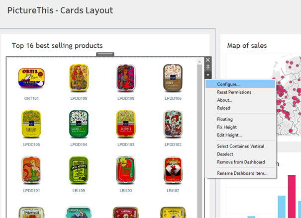
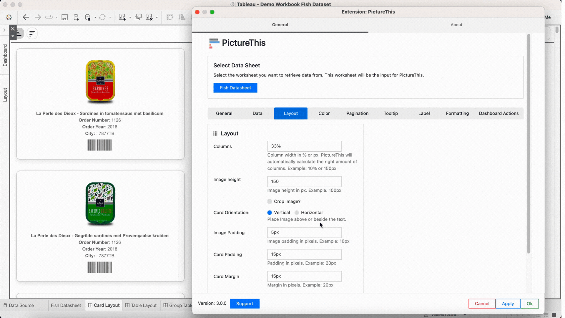
This will open the configuration screen of the PictureThis extension.
Connecting to your data
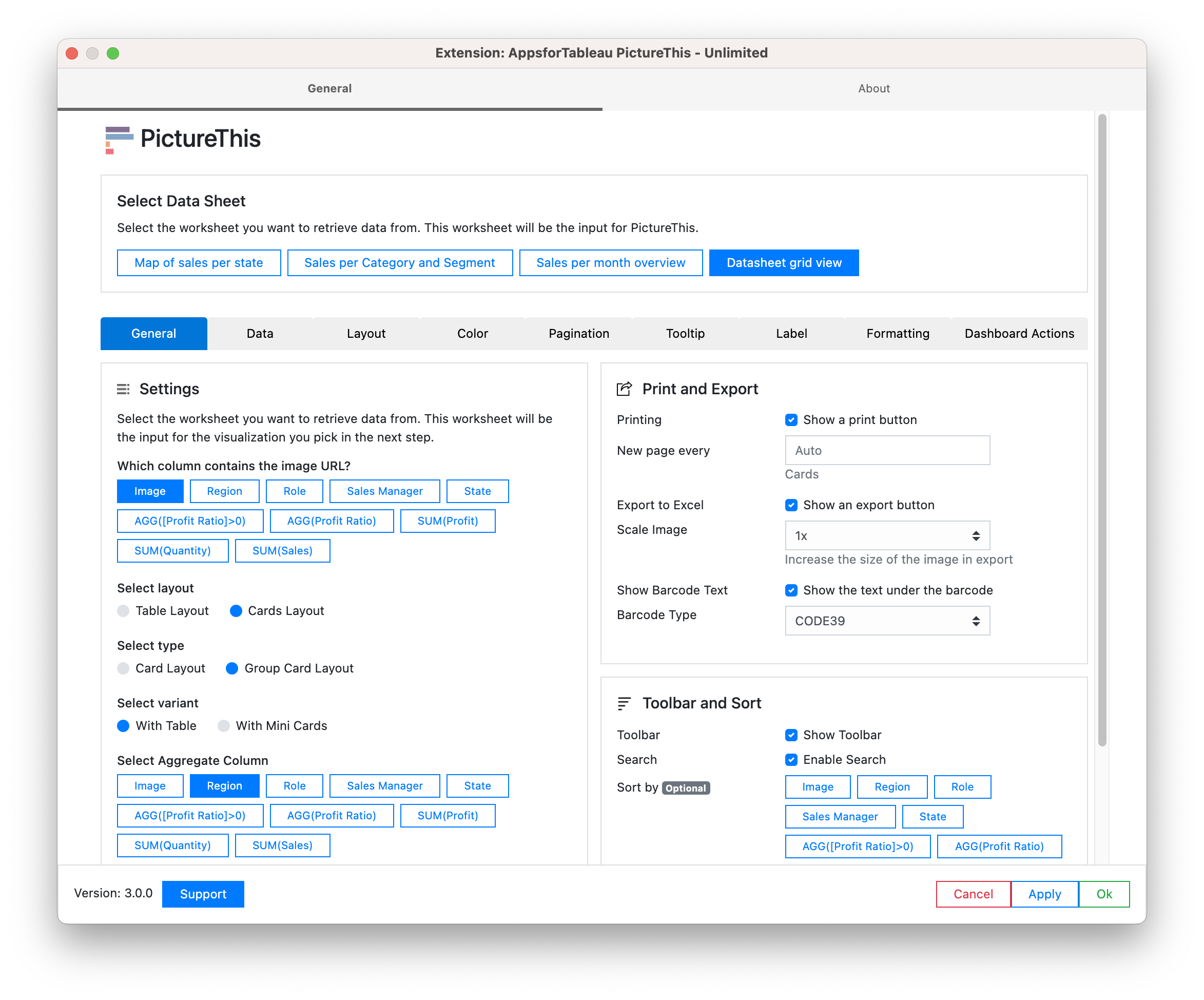
The first you must do to configure your extension is select the datasheet that holds the columns that you want to use in PictureThis. In your preparations it is important to first add the datasheet to your dashboard before configuring the extension, follow our BLOG for best ways of setting up your data. Now in the configuration screen select the worksheet you want to retrieve data from. This worksheet will be the input for PictureThis. You can always add extra fields to this datasheet and open the configure screen again to use them in your PictureThis extension (labels, colors, links etc.).
General
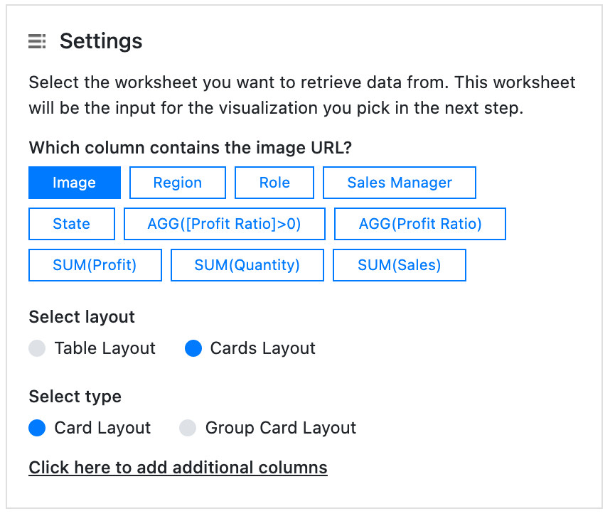
Settings
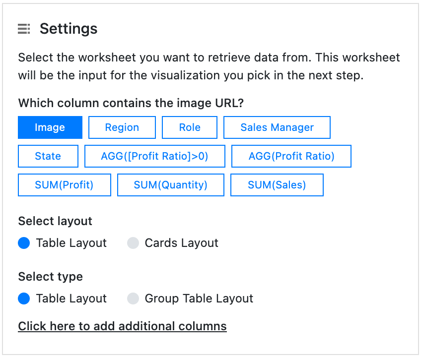
Which column contains the image URL?
This setting is crucial for the PictureThis extension. You can see the list of fields (dimensions and measures) that are available on the datasheet you selected in the previous step. Just select the dimension that holds the url to your image. This must be a “http://” or “https://” url that is free accessible and not password protected. The image must be of the format jpg, png or gif.
Select layout & Select Type
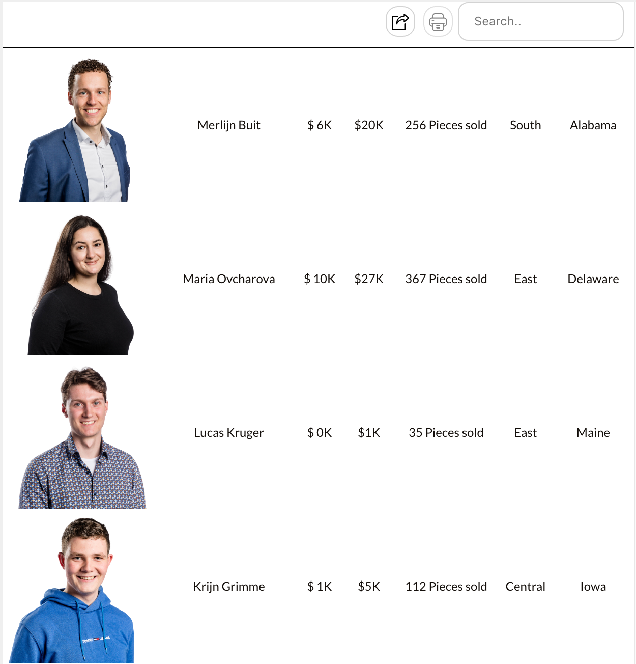
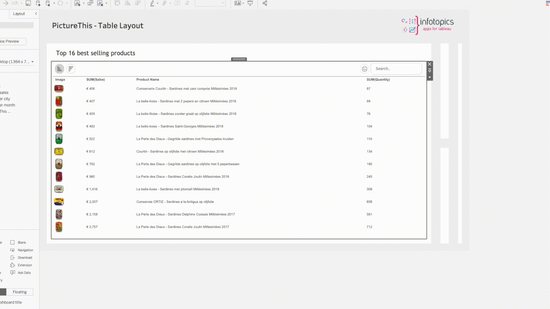
PictureThis has two layouts ‘Cards layout’ & ‘Table Layout’. Cards layout will show the images as a card with information underneath for example (the Image Grid). Table layout will result in a table showing your image present alongside your additional information on the same row. Both types (Cards Layout as well as Table layout) allow for grouped or aggregated views withsub-tables or mini cards. Below some options are displayed.
The Visualisation
The Configuration
The Visualisation
The Configuration
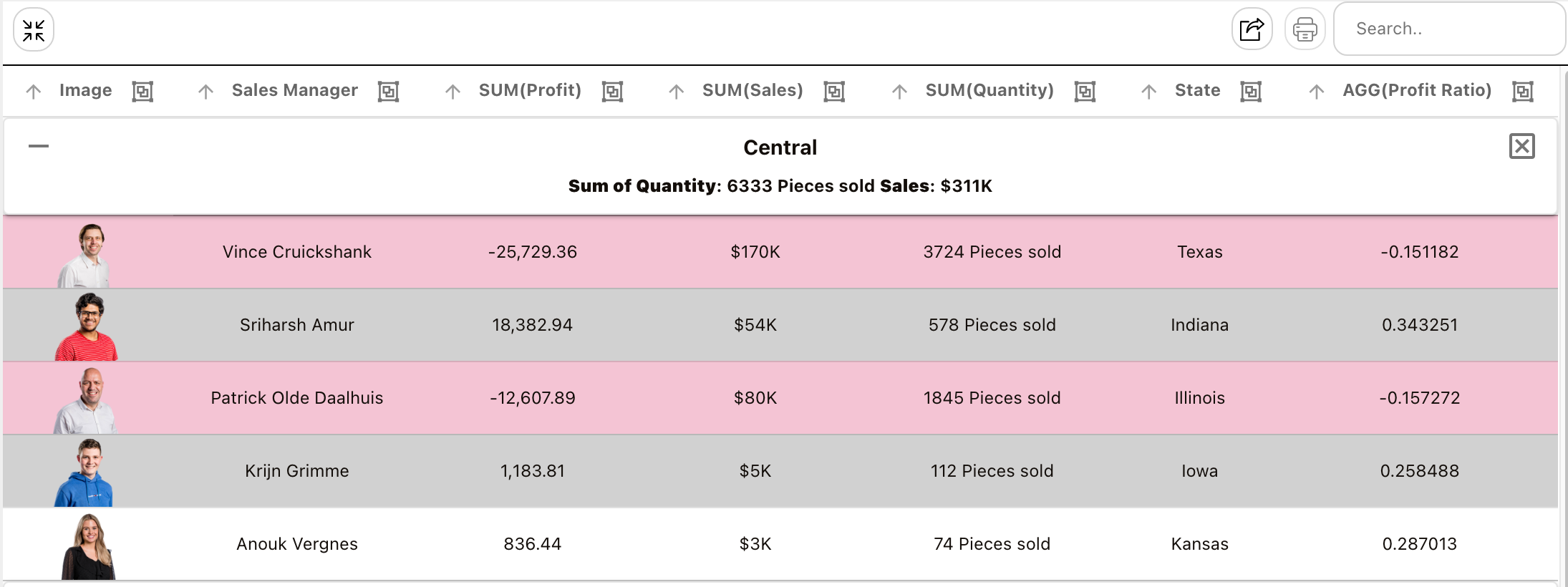
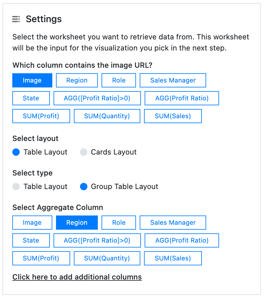
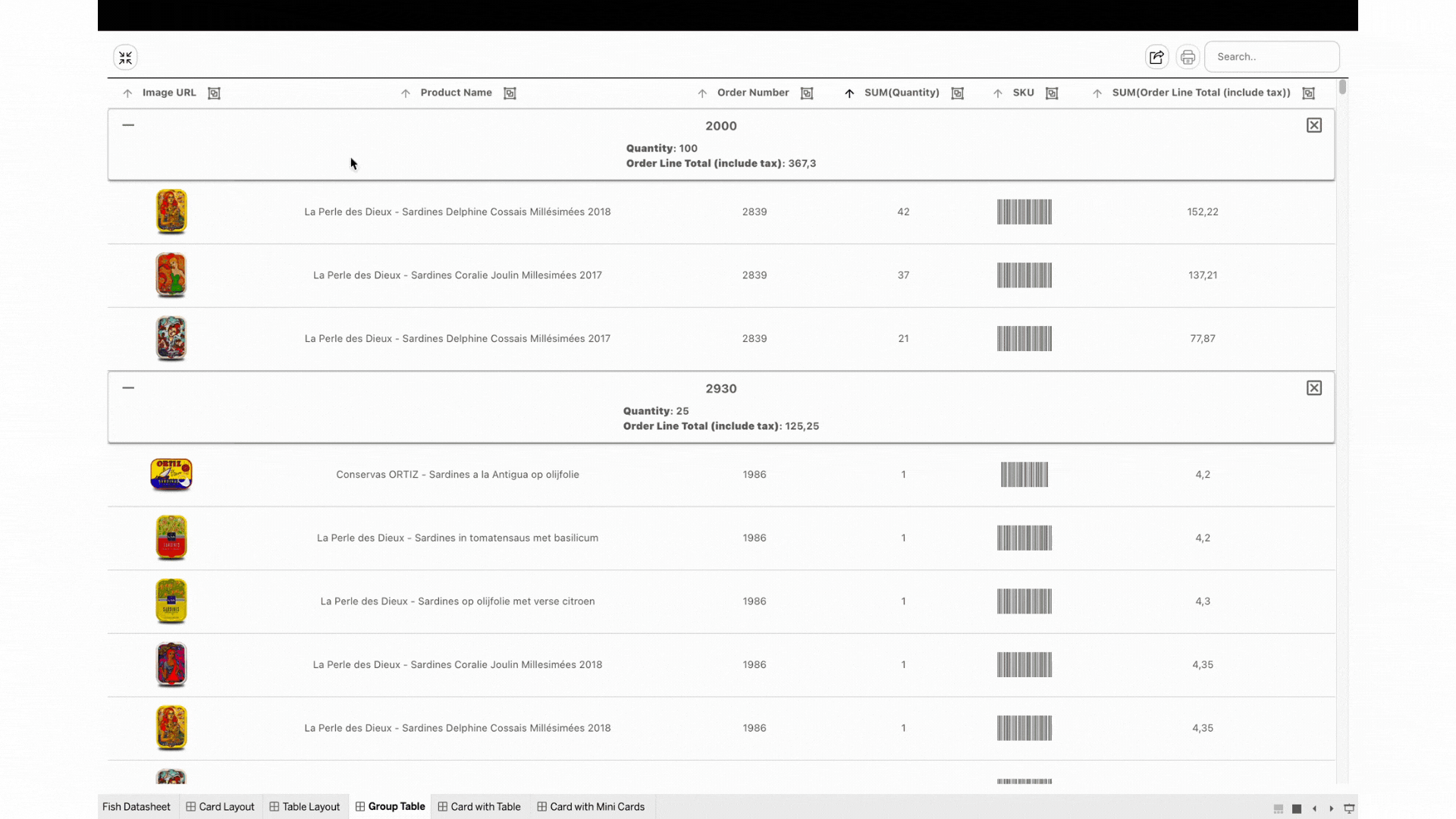
The Table layout with the “Group Table Layout” option enabled allows users to embed an interactive table while aggregating or grouping your data based on one of the dimensions. This feature is particularly useful for viewing individual rows while also having additional information about the aggregated rows in a single glance. The table can be used interactively to sort columns using the included buttons, making it a versatile tool for data analysis.
The Visualisation
The Configuration
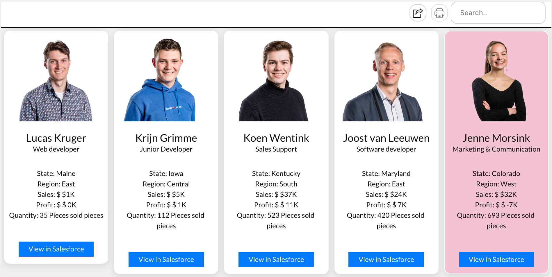
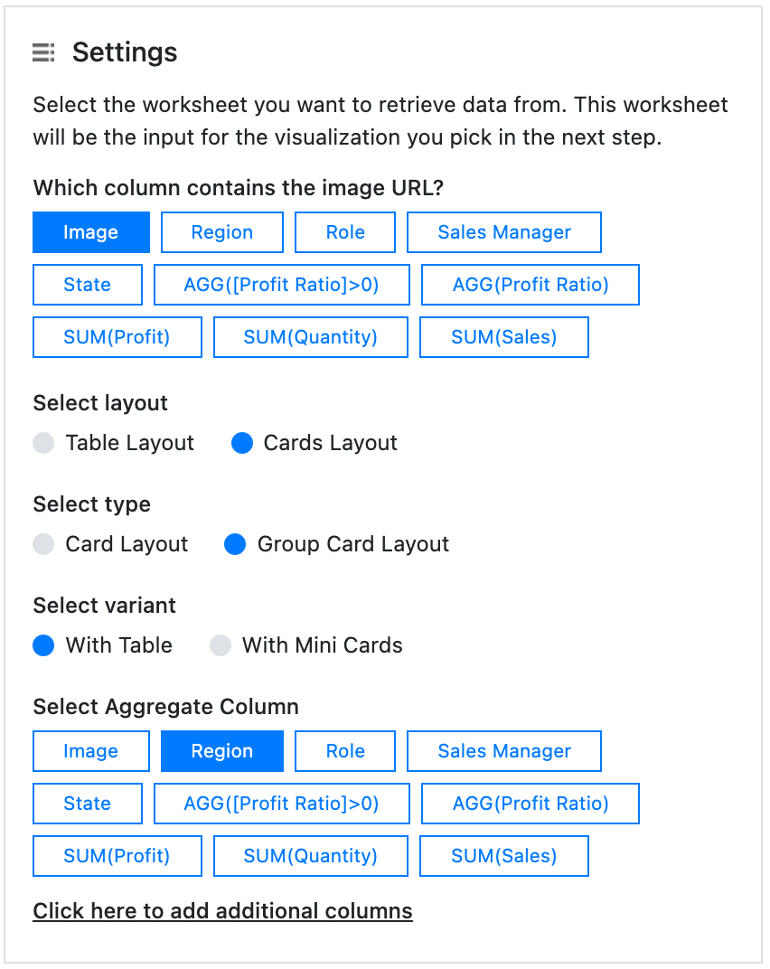
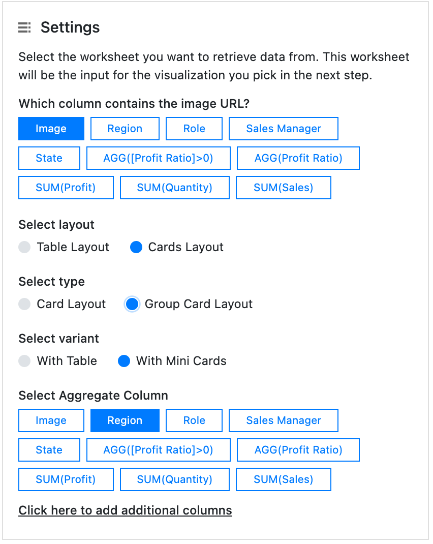
When using the Cards layout you can also aggregate or group your data on dimension values. This allows you to display a “Summary Card” that can show extra properties of your grouped or aggregated data. The Summary Card comes with the “Group Card Layout” allowing users to display calculations on the aggregated/grouped rows. With the ability to show the sum or average of columns using the aggregated rows, this new card provides users with a more detailed and comprehensive view of their data, empowering them to make more informed decisions. In the below example we chose to show the aggregated/grouped data as a mini table.
The Visualisation

The Configuration
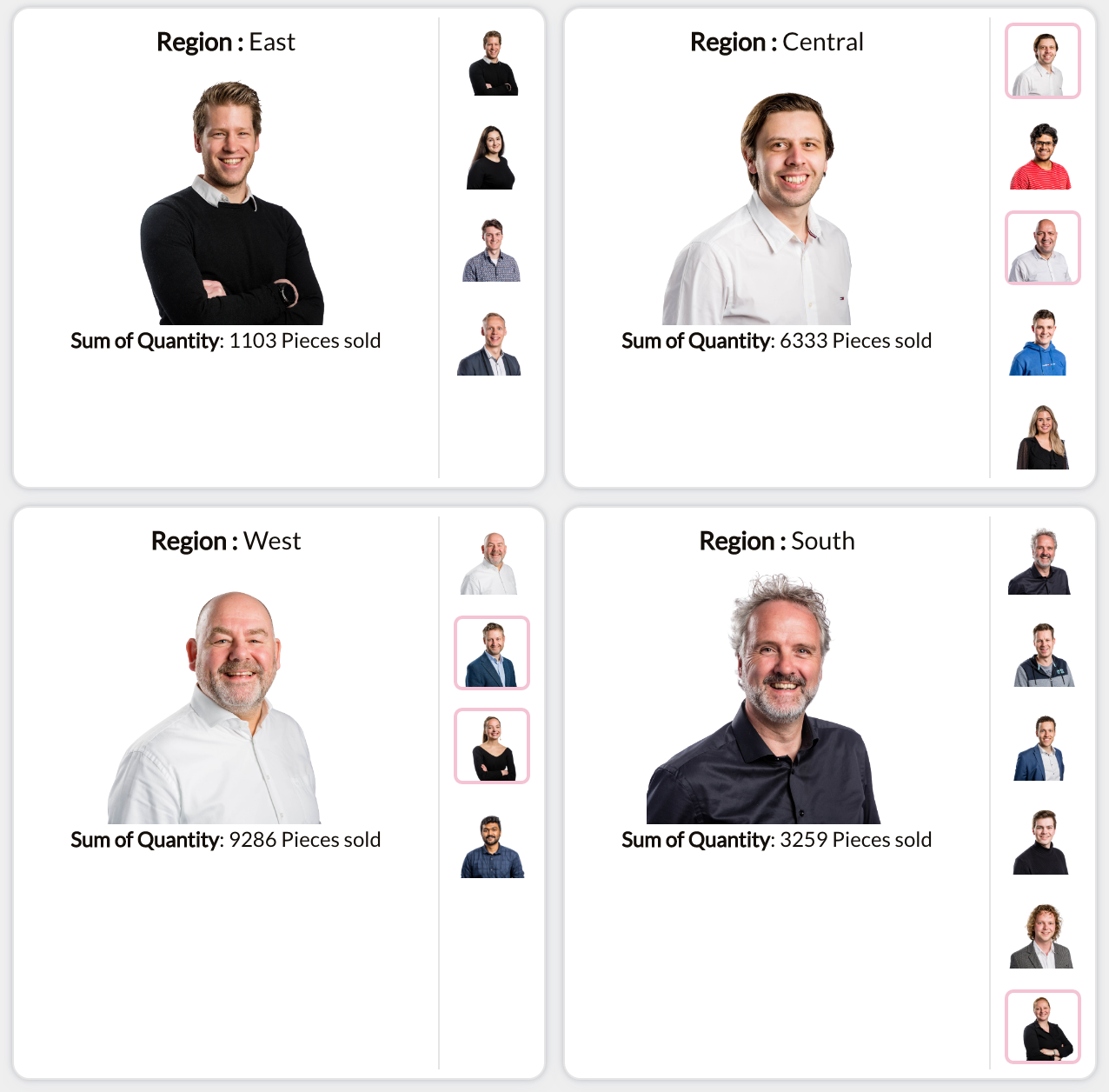
The images of aggregated rows can be viewed as mini cards along or below the aggregated “Summary Card”. By clicking on the mini card, the details of that item can be viewed on the grouped card. This feature offers a simple and visually appealing way to explore row values, enhancing the user interface of your dashboards.
The Visualisation
The Configuration
Print & Export
Printing is for Tableau Cloud and Tableau Server environments, installing on premise (enterprise) will allow your pictures to be printed too. Due to technical reasons, exporting images to excel is only available within the enterprise version of PictureThis. Export to excel will always be in table layout even if you try to export with cards layout.
In the layout configuration pane, you can configure what the export should look like. The scale image option lets you configure if the image in Excel should be magnified x-times. The “Show Barcode Text” options lets you put the actual text below the barcode image in Excel if you used the barcodes in your PictureThis extension. Make sure you select the proper matching Barcode font if you use this option.
Instead of images exported as images overlaying cells in excel, you can lock images with a cell using the “lock image” option. You can export your data to multiple excel sheets, splitting them based on the different values within a dimension (I.E. one page per category). Freezing the headers will allow you to scroll through your exported data with the headers permanently visible. If required, you can even add extra columns from your datasource (that aren’t visible in the dashboard) to your export.

Once the configuration part is done you can use the export button in the toolbar to export the instance of the PictureThis to excel format.

Toolbar & Sort
Show Toolbar
Showing the toolbar is optional as not all creators desire their users to have access to these option.
Enable Search
Search through your cards by searching for information shown with the cards. Whether it’s a SKU number, product name or a price or an item the view will be filtered to just show your search results.
Collapse
If the aggregation table layout is chosen, then an option called collapse button is visible, click to expand and close all grouped tables.
Sort by
Choose which field in your data set your images are sorted by, once chosen you can sort ascending or descending
Data
Select additional data to display in the table or card
Once connected to your data sheet the data tab will show you all available data you can show in PictureThis, whether it will be information in your card or columns in your table. The order each one is chosen will be the order represented in the viz.
Select Image URL column for flipped image
Connect to your data that holds the url for your second image. When hovering over an image PictureThis will show you this image, great to show front and back of your products, different colors and sizes, the possibilities are endless.
Customise card content works for card layout and both the aggregated card layouts. Here you can style what’s shown on your card using html and bootstrap.Remove the aggregation methods from measures to support multi language Tableau deployments. For example SUM(Sales) = (Sales).
Summary Card
When using Grouped Laouts for either the Tablea Layout or the Cards Layout you can customize the Summary card that is presented on the aggregated level. In this Summary Card you can use the measures available in your data (and aggregate them). By default all measures will be summarized but you can change the type of aggregation to Averages as well.
Table Layout
When there’s a table layout as part of your view, these will be the available options.
Here you can set the padding (whitespace) between the rows of your PictureThis Image Table. Set the row padding using a number of pixels. For example: 10px
Enter the width you would like the table to be in pixels. Leave this field empty for auto width settings (100%).
Click to turn on or off the display of Column headers in your Table view. The Headers will be ‘sticky’ headers and they will keep their position even when you use the scroll bar.
Sticky headers will freeze the header names in your table so they’re always shown in view.
Adjust the Font size and color of the Table Header to fit your company style.
Fix the size of each column by an exact size using pixels or as a % of the width of the viz.
Card Layout
Decide whether to place your image above or beside the text.
This setting (padding) determines the space between the edge of the Image Card and the image. This will make sure that your mages are not glued together in your Image Grid but have a small whitespace between them. Choose the image padding range within your Table cell using pixels. For example: 4px to generate 4 pixels of whitespace around the image.
The Card Margin is the space between each of the cards in your layout, to add more space between each card add enter that here in pixels.
Enable or Disable the backdrop shadow effect to match the desired look.
Grouped Layout Table
When there’s a grouped layout as part of your view, these will be the available options.
This option is only available in the Cards Layout and allows you to set the width of the (grouped) cards columns. The best option is to use percentages like 50% to show to columns in your PictureThis container.
This option is only available when you selected a grouped Cards Layout. Here you can enter the height you would like the Group image to be in your PictureThis Cards layout. Use a number of pixels, for example: 100px
Change the orientation of where you image should sit, either above the text or beside.
Here you can set the padding (whitespace) between the rows of your PictureThis Image Table. Set the row padding using a number of pixels. For example: 10px
The Card Margin is the space between each of the cards in your layout, to add more space between each card add enter that here in pixels.
You can show your cards with a slightly rounded border. Using % or px enter your Cards border radius.
Enable or Disable the backdrop shadow effect to match the desired look.
Enter the width you would like the table to be in pixels. Leave this field empty for auto width settings (100%).
Click to turn on or off the display of Column headers in your Table view. The Headers will be ‘sticky’ headers and they will keep their position even when you use the scroll bar.
Sticky headers will freeze the header names in your table so they’re always shown in view.
Adjust the Font size and color of the Table Header to fit your company style.
Fix the size of each column by an exact size using pixels or as a % of the width of the viz.
Color
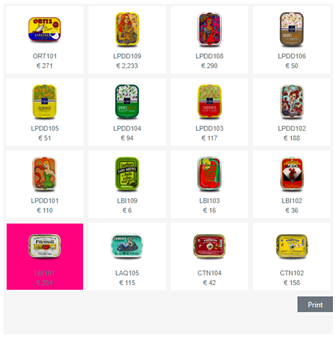
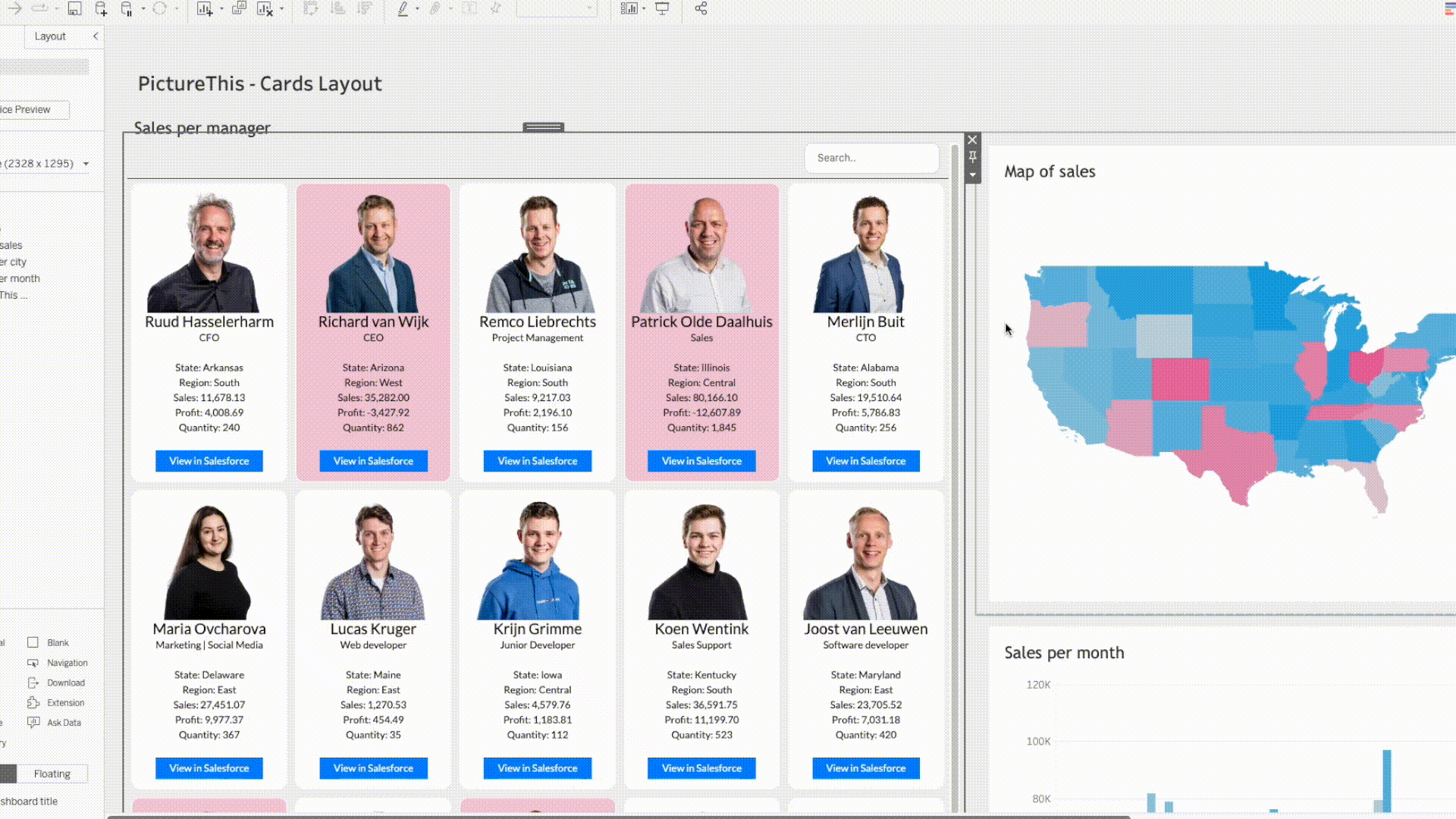
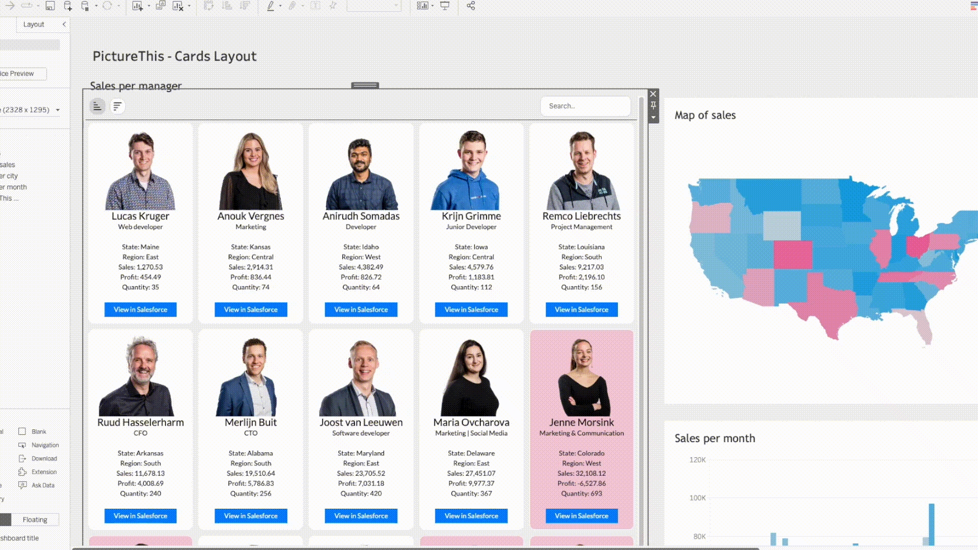
Use the tick box to activate conditional coloring of your Cards. You can use one of the columns in your datasheet to trigger conditional Card coloring. This makes the special Cards stand out of the rest. Choose the dimension and customise each card with their own color using the color palette. You can create something like the image below:
Change the basic row color by using the color palette. This is available wherever a table is present.
Pagination
Set the amount of items you wish to see per page, only these items will be seen removing any scroll bar and giving a better look. The page numbers will be at the bottom of the viz, to skip through pages of your data.
Tooltip
If you want to use a tooltip on your Cards or Table cells, use the tick box to enable it. Here you can configure what content is shown in your tooltip. Add text and fields and customize exactly how you wish. You can use fields only once. You can use html and bootstrap to customize the card content. The aggregation names like SUM are automatically removed. Ex: SUM(Sales) is automatically Sales when the column in clicked. Tooltip now supports formatting, such as having a barcode present in your tooltip!
Label
Header Align
In table view, change the alignment of headers, giving your data a polished and organised look. Whether it’s left, center, or right alignment, easily customize your tables to suit your needs.
Text Align
In Table view you generally want to align your text to the left (or right when in an RTL region) while Cards view often looks best when text is centred in the Label of the Cards. This option allows you to set the alignment of the text in your card or Table cell by choosing Left, Centre or Right.
Font size
Use the dropdown to change size of the font. Min size 6pt, max size 24pt.
Tableau & Google fonts
When you change the font of your workbook, PictureThis will incorporate that font in to the extension to match your dashboards style. Tableau and Google fonts can be used.
Font Family
Now added – Google Fonts! Enable google fonts to your font library. Change the font from the dropdown to improve the look of your dashboard and match your corporate identity.
Formatting
All fields you selected to be present in your Image Grid or Image Table can be Aliased and formatted according to your wishes. Change to a decimal, percentage, text or even a barcode! Add an alias on each as well as a prefix and a suffix.
Dashboard actions
Action Type
PictureThis supports different types of Dashboard Actions. This Action Type setting allows you to set two of them; the Filter Action and the Highlight Action. The Filter Action makes sure your target sheets get filtered when you select one or more images in the Image Table or Image Grid. The Highlight action will not filter the target sheets but highlight the marks that belong to the selected image in you Image Grid or Image Table.
Target Sheets
Decide which sheets will be triggered with your chosen Dashboard Action (Filter or Highlight). Filters can no longer be applied to the source sheet. The configuration only displays other available data sheets. Even if source is selected for the older versions of PictureThis, the extension will skip the source sheet with the new updates. This is to avoid filtering the extension’s datasheet to only show the selected items.
Selected Field
Decide which field you want to select to trigger the dashboard actions on your Target sheets.
Filter type
Sometimes you want a dashboard action to be triggered on a single select only, sometimes you want to support multi selections as well. This option allows you to switch between both filter variations.
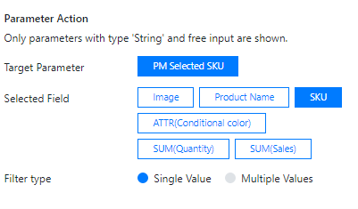
Parameter Action
A very powerful feature of the PictureThis extension is the Parameter action. You can set the value of a parameter by clicking the image in either your Image Grid or Image Table. This configuration option lets you select the parameter you want to update on a selection. In the example below the parameter “PM Selected SKU” will be updated with the SKU when I select a product in my Image Grid of PictureThis:
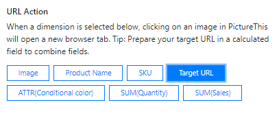
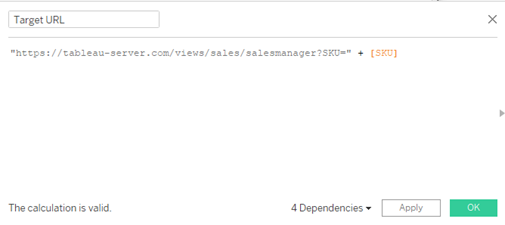
URL Action
Another powerful action type is the URL action. This feature allows you to navigate to a url in a (new) Browser window just by clicking one of the images in the Image Grid or Image Table. You can use a calculated field to generate your target URL and add it to your datasheet. In the example below I have set the URL Action to navigate to my “Target URL” which is a calculated field that resides in the Data Sheet that feeds the extension
Search bar
The new search bar feature provides a convenient way to filter your data. To use it, enable the toolbar in the configuration and then click on “Enable Search.” This opens the search bar in the toolbar. You can simply use a search term to filter through the data.

Sort columns
Configure the sorting column and enable the toolbar on the configuration page. Two new icons should be visible in the toolbar representing the ascending and descending directions
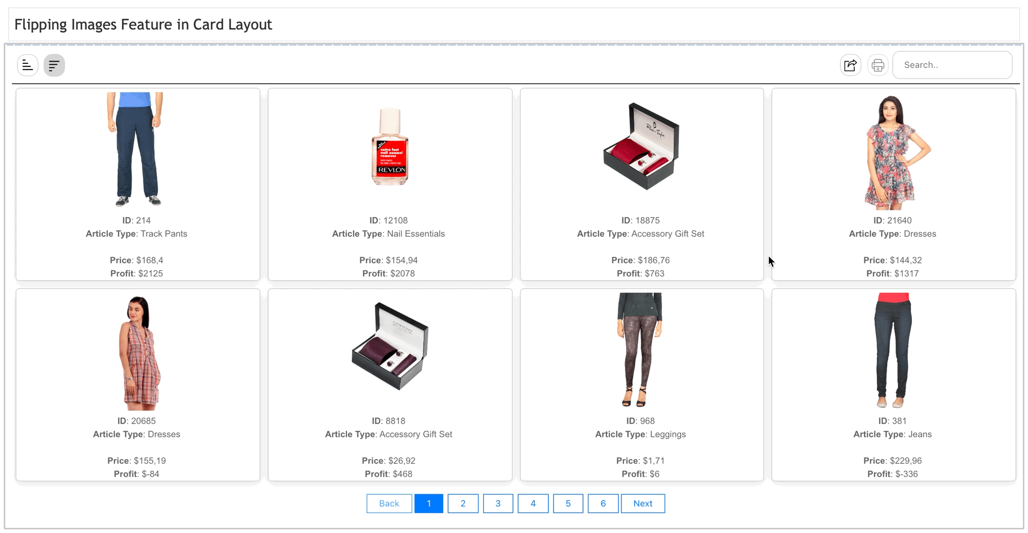
Flipped images
Now users can add a back image column to their existing images. This allows for a more immersive and interactive experience as users can hover over an image to reveal its back image. Show the front and back of a garment, different sizes of a bag or different colors of a shirt!
We love to make solutions and help Tableau users to do things more efficiently. If you have feedback, ideas, questions or need support, please make sure to share it with us! Also, don’t forget to follow us on social media for our latest news and updates.