ShowMeMore
Create beautiful new visuals in Tableau with just a few clicks.
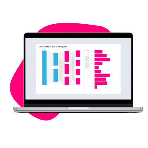
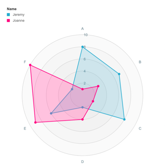
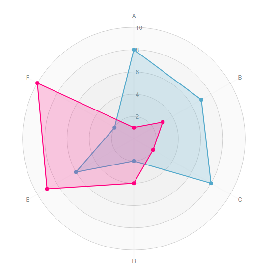
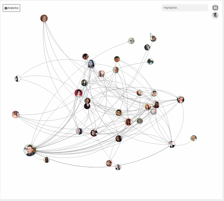
Want to quickly embed an interactive Sankey diagram to visualize flows? In urgent need for a flexible Radar Chart in your HR dashboards? Visualize a dynamic Network Graph to illustrate your department structure? We’ve got you covered.
Available as Viz Extensions soon!


Next-level data visualizations
15 Amazing visuals for your use case.
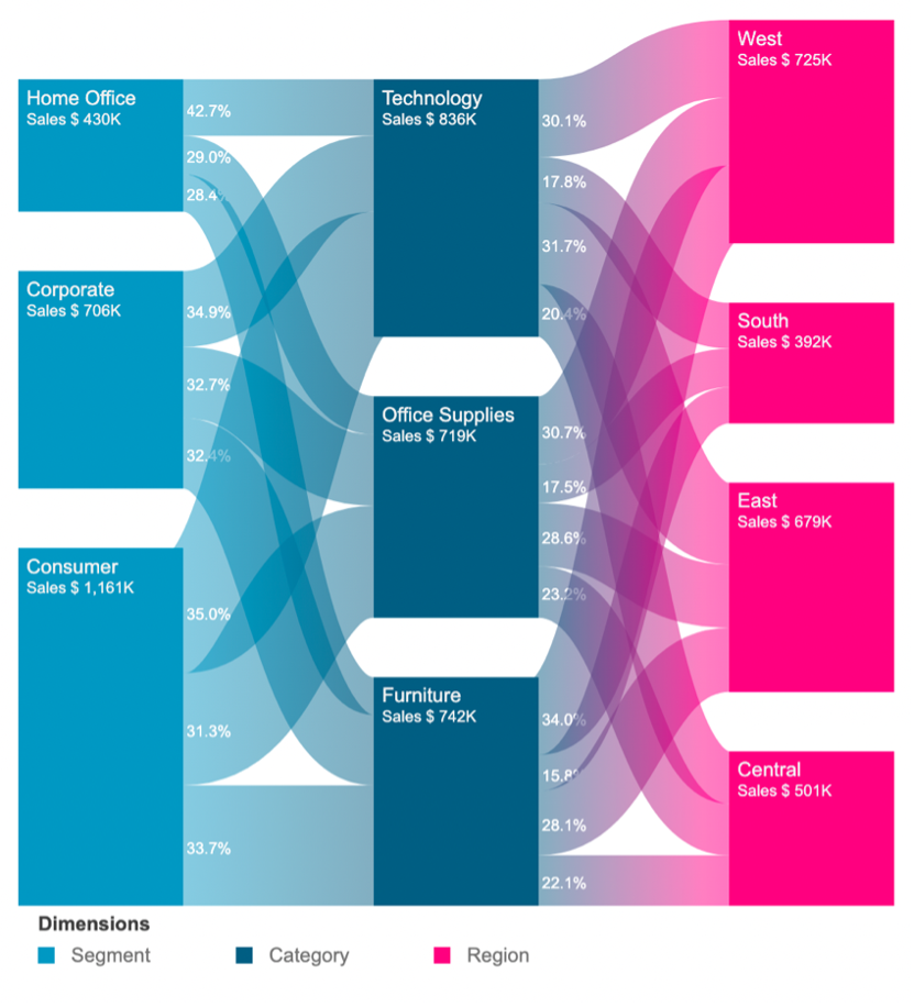


“I installed ShowMeMore in Tableau Desktop, imported the data I wanted to visualize and then I clicked a little bit around. Just like that, I created a Sankey Diagram! It only took about a minute, and the best part was that it effortlessly worked. It was really drag and drop on the dashboard and it works, which was the highlight of the experience.”
– Martin Seifert, CRM & Data Analytics
Learn from real-life use cases.


ShowMeMore in action with pre-built solutions.
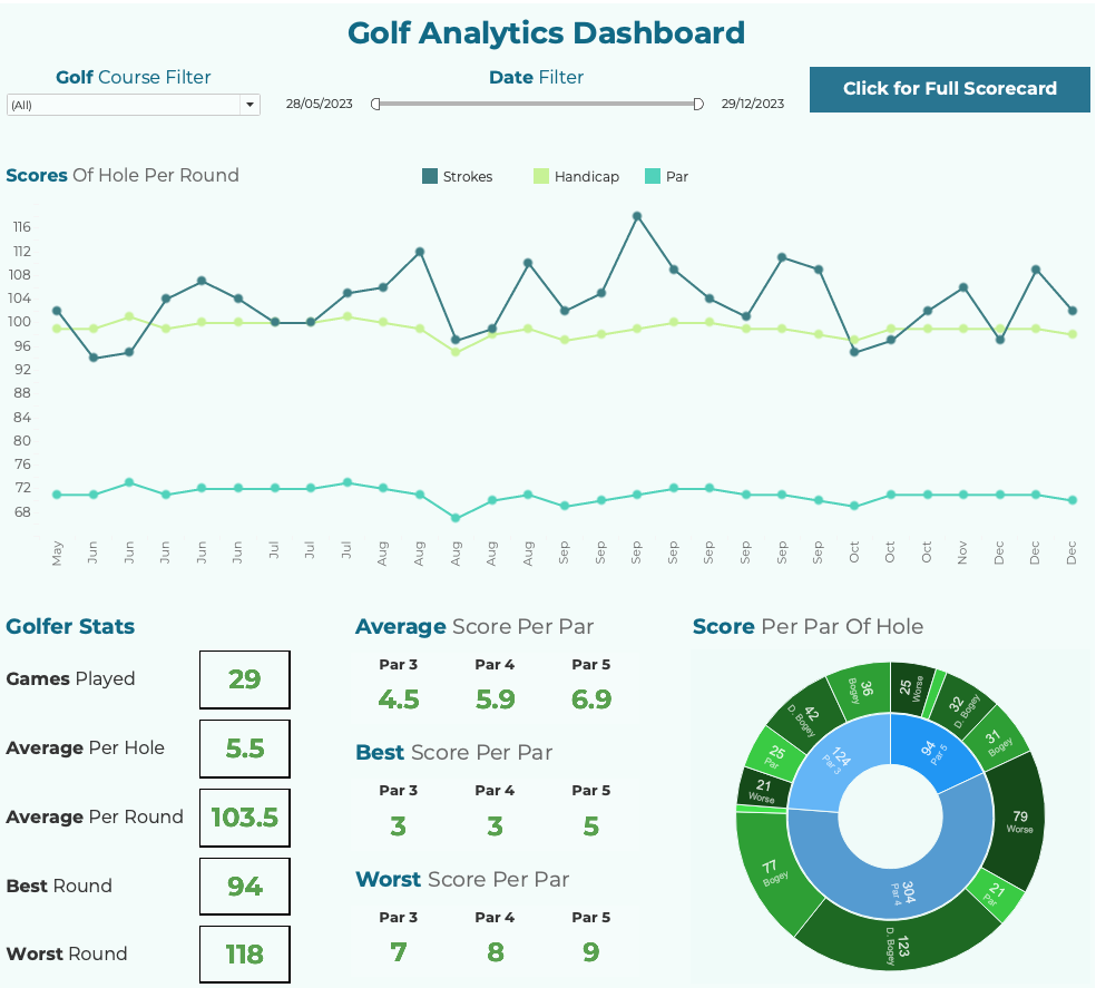
All golfers seek ways to improve their game, whether it be a new set of golf clubs, lessons from a club pro or playing as often as they can. With this dashboard, users can use Tableau to check if their game improvements are making a difference. The highlight of the dashboard is Apps for Tableau’s Sunburst Diagram showing what scores they got on each par, giving great insight in to which par they need to improve in.
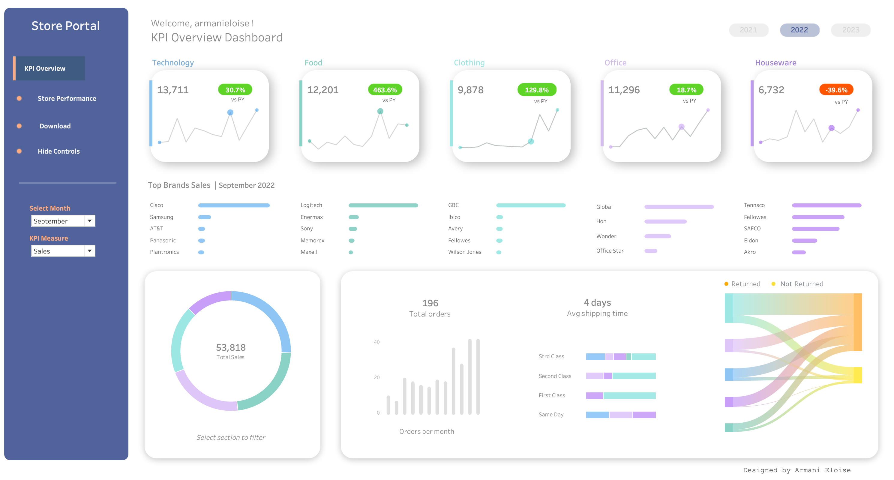
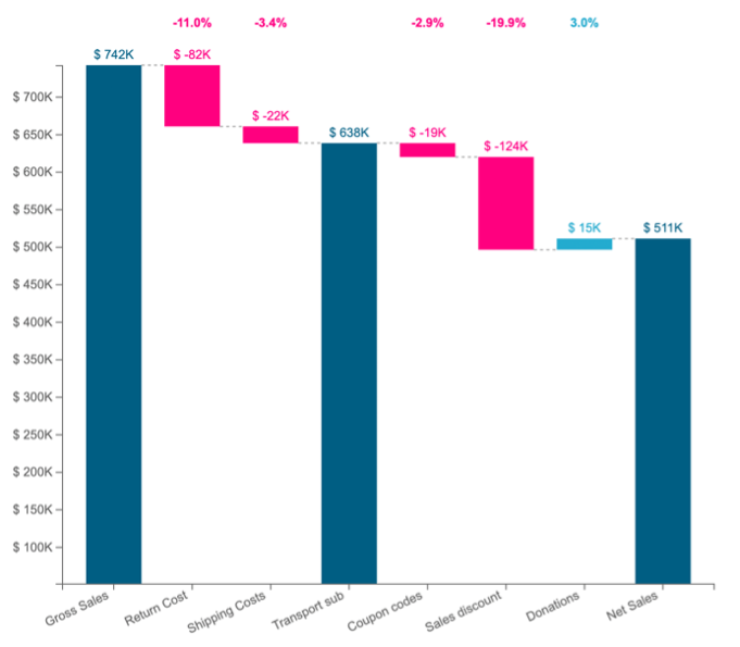
Elevate your business insights with our Retail Store Performance Dashboard, a powerful solution that effortlessly tracks year-over-year performance across departments. Instantly toggle between years and gain a quick overview of top brands. The customizable Showmemore extension offers a comprehensive view of returns and non-returns. With sleek parameter selections, effortlessly switch between sales and profit views. Accessible through a user-friendly portal interface, this versatile solution adds precision and style to your retail analytics, unlocking deeper insights and maximising your retail success.
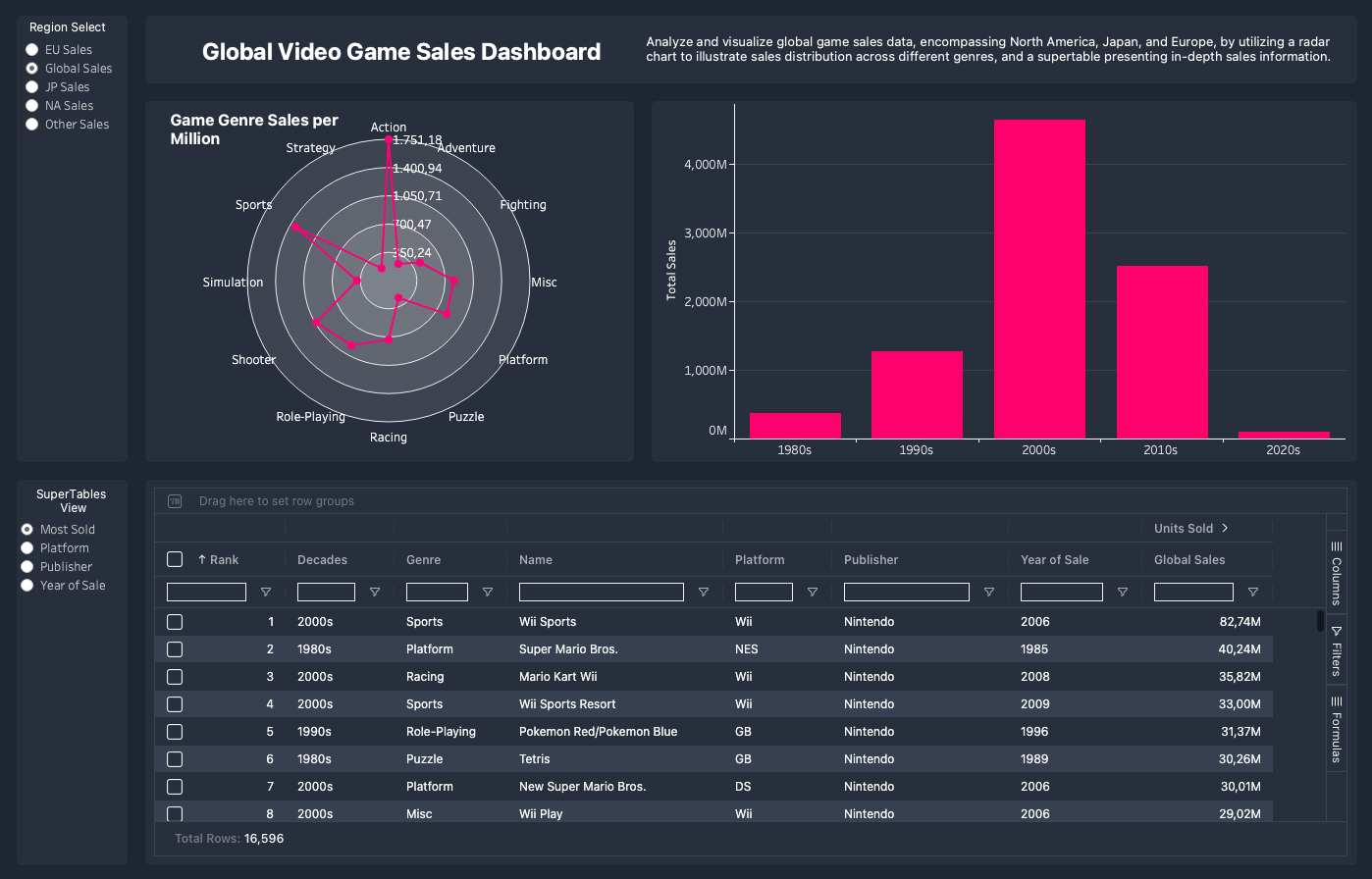
Unlock the world of global game sales with our ShowMeMore Tableau dashboard! Dive into North America, Japan, and Europe's gaming trends using a radar chart and supertable for a quick, insightful adventure. Elevate your understanding of sales distribution and genre dynamics.
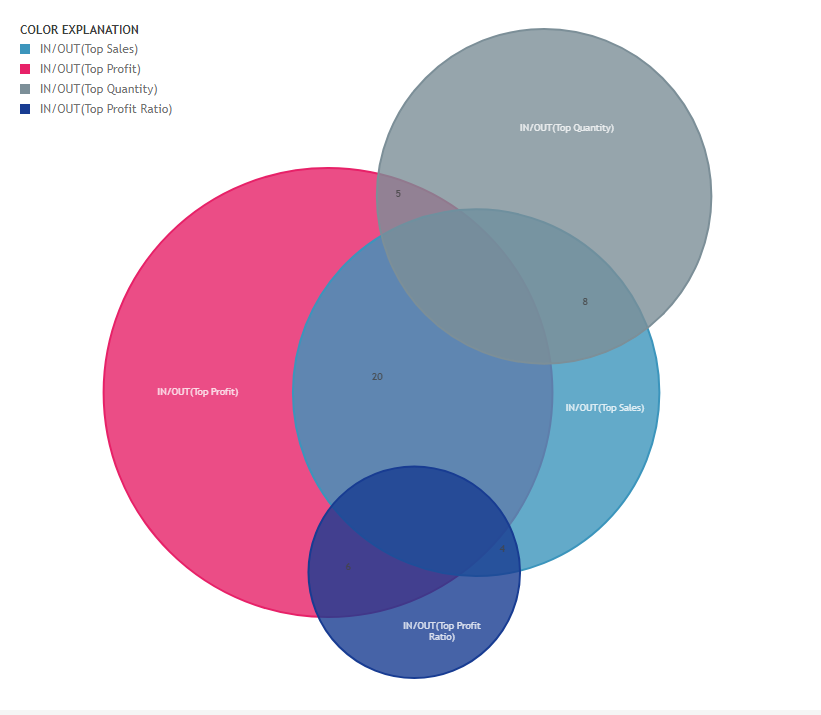
“Thanks to ShowMeMore, the team is now able to understandably visualize all flows and present them easily to the stakeholders.”
– Samuel Harper, Head Global T Business Systems at WWF

Let us help you get started.
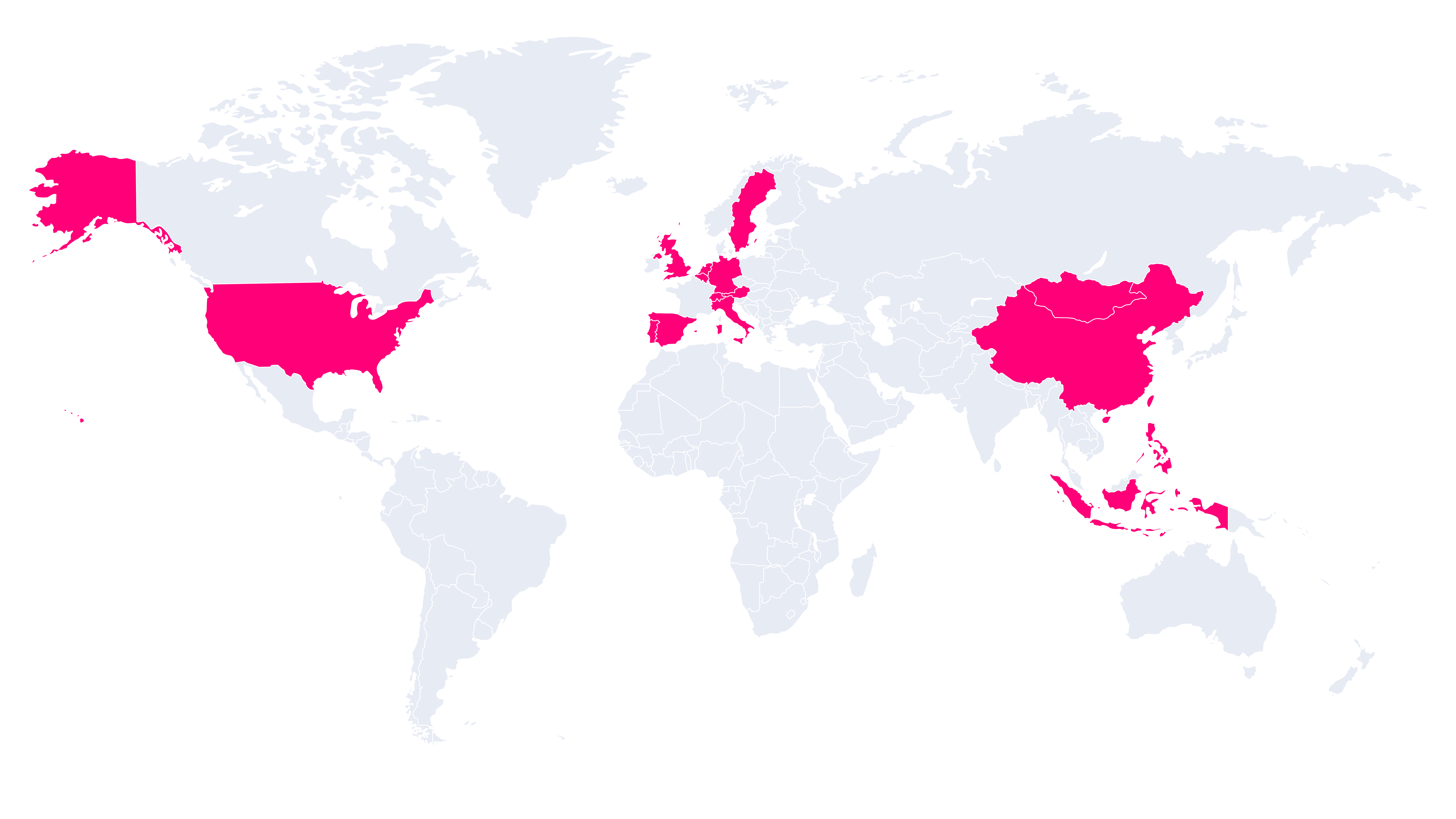
Revolutionize your data with trusted partners.
The Apps for Tableau partner network is a trusted and experienced team of consulting and reseller partners, dedicated to serving professionals worldwide in their native language.
Discover how ShowMeMore can revolutionize the way you handle data, enabling you to make better-informed decisions and achieve remarkable outcomes in your industry. Locate one of our trustworthy partners and start optimizing your data-driven journey.
FAQ
Yes, you can request more information on the pricing page.
Yes, you can request more information by filling in the form on the pricing page.